Featured projects
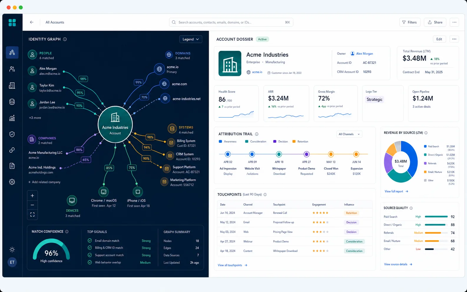
Customer 360 and Revenue Attribution
Account-level customer view for GTM reporting.
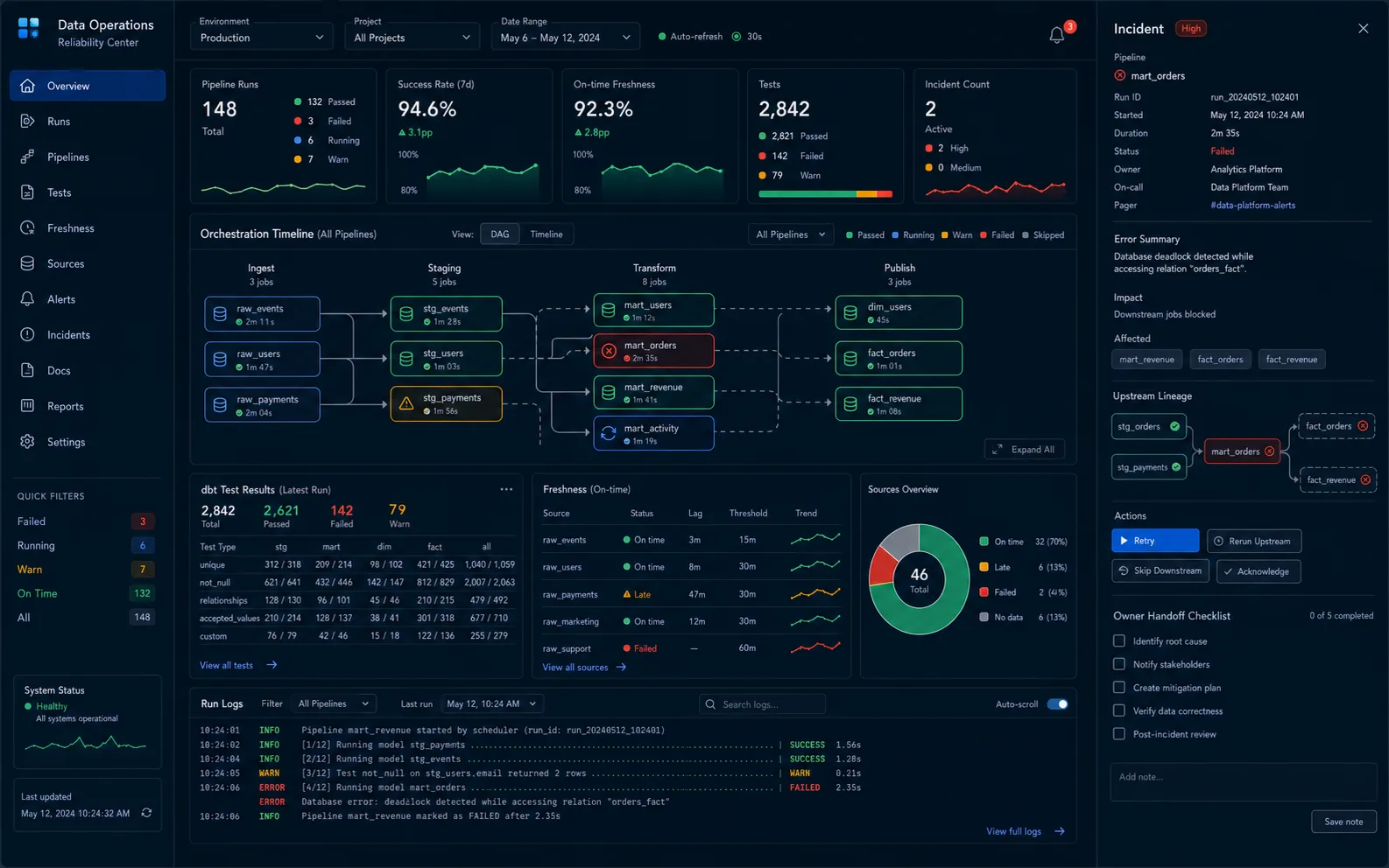
ELT Reliability and Monitoring
Tests and monitoring for steadier ELT.
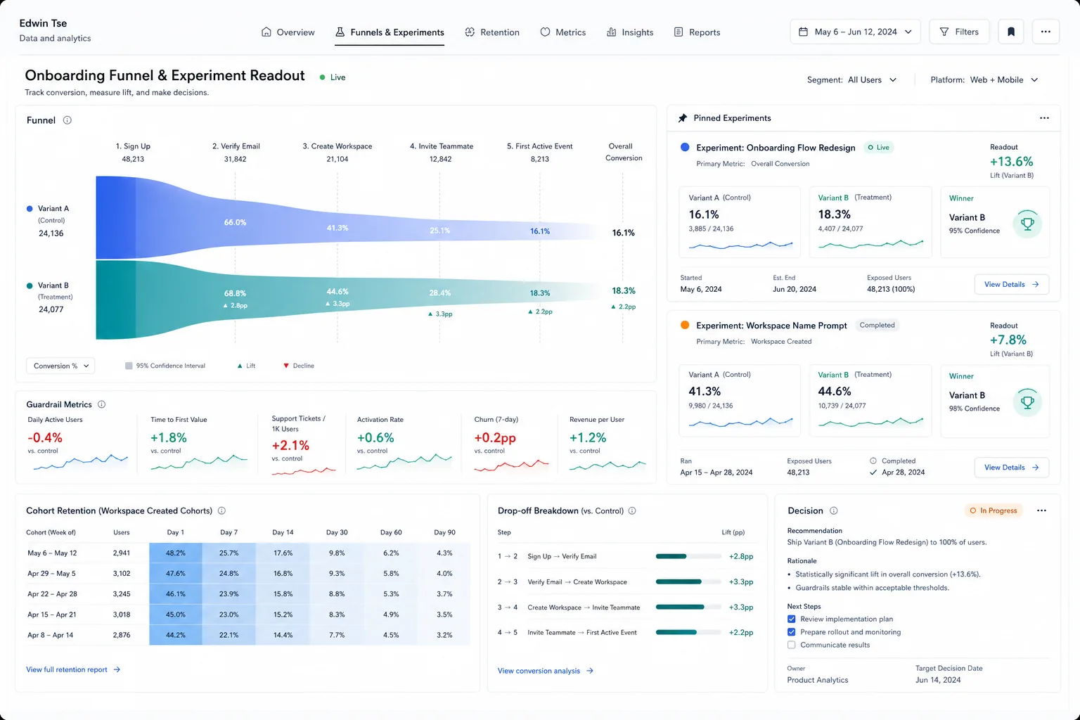
Onboarding Funnel and Experiment Readouts
Funnel tracking and experiment readouts.
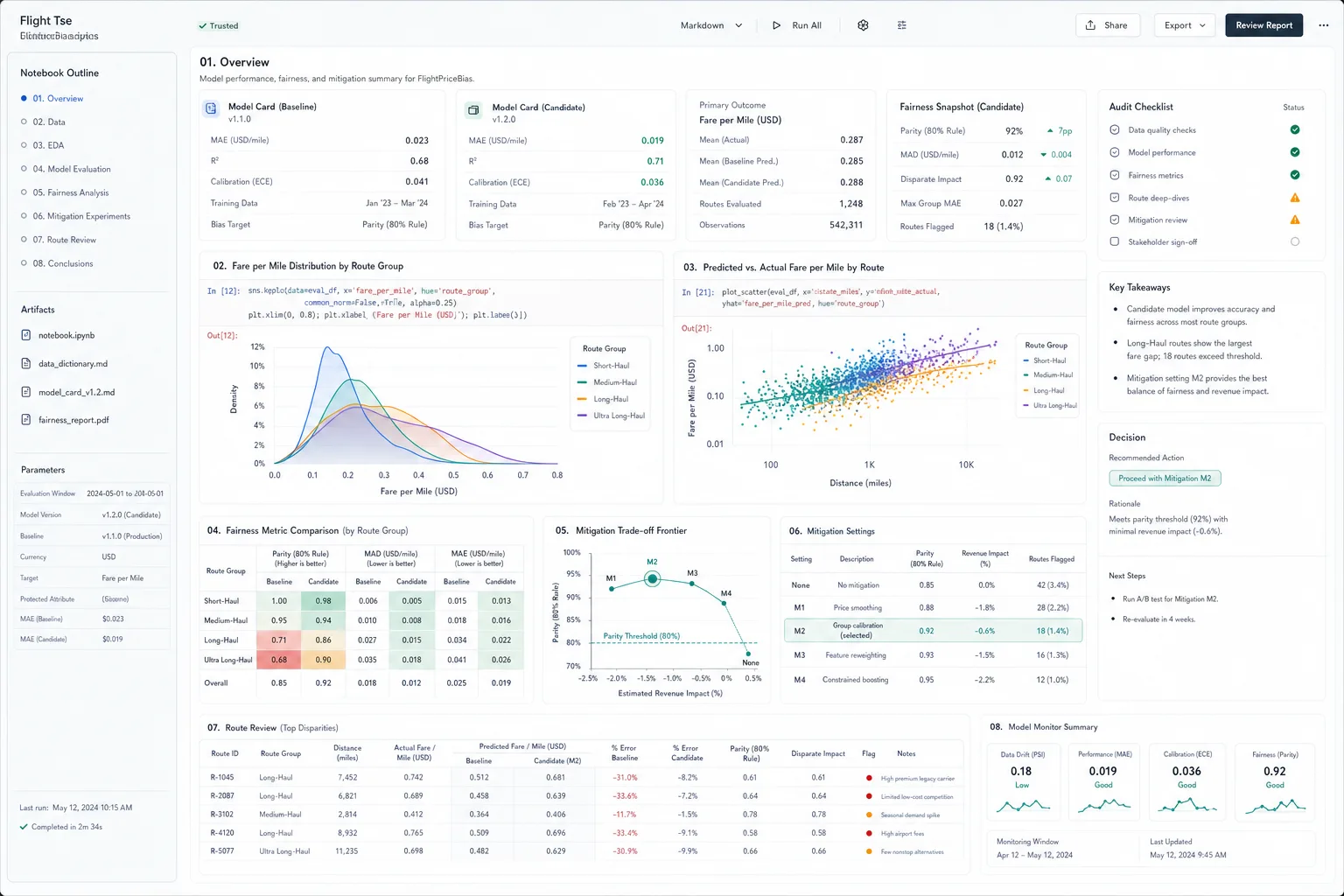
FlightPriceBias
Airfare model review with fairness metrics.
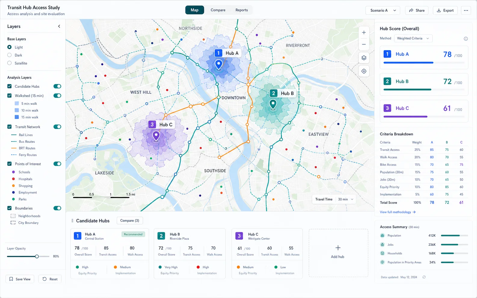
Transit Hub Access Study
GIS study of transit hub access.
More projects
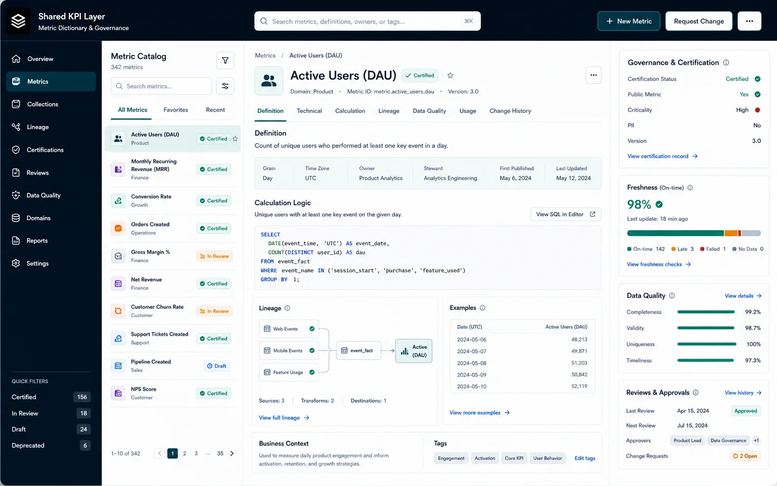
Shared KPI Layer for Product and Ops
Shared KPI definitions for product and ops.
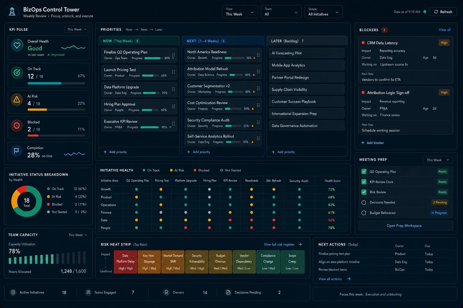
BizOps Control Tower
Weekly view for blockers and priorities.
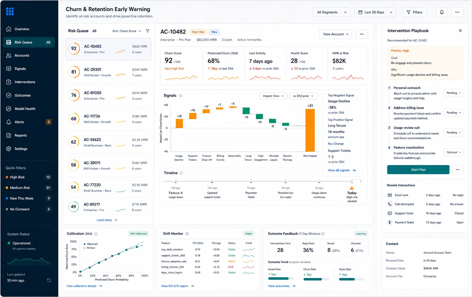
Churn and Retention Early Warning
Retention-risk workflow from product and support signals.

Compliance Review Operations
Compliance queue visibility for intake and review.
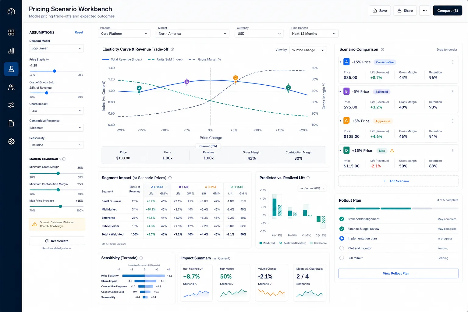
Pricing Scenario Workbench
Scenario workbench for pricing trade-offs.
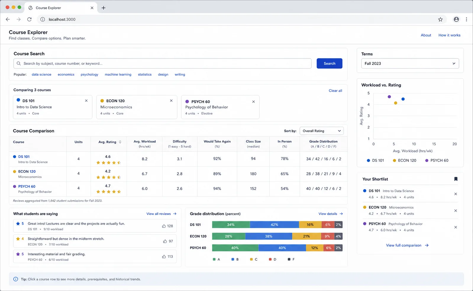
craveforcapes
Course explorer built from UCSD CAPE data.
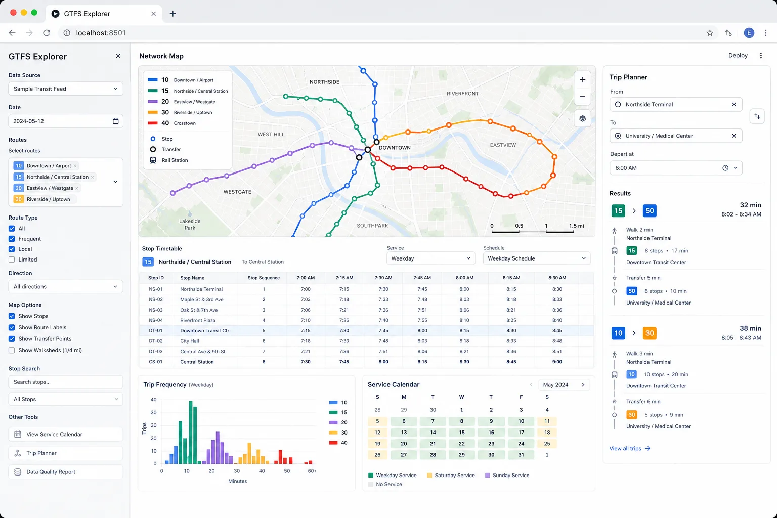
GTFS Explorer
GTFS route and stop explorer.
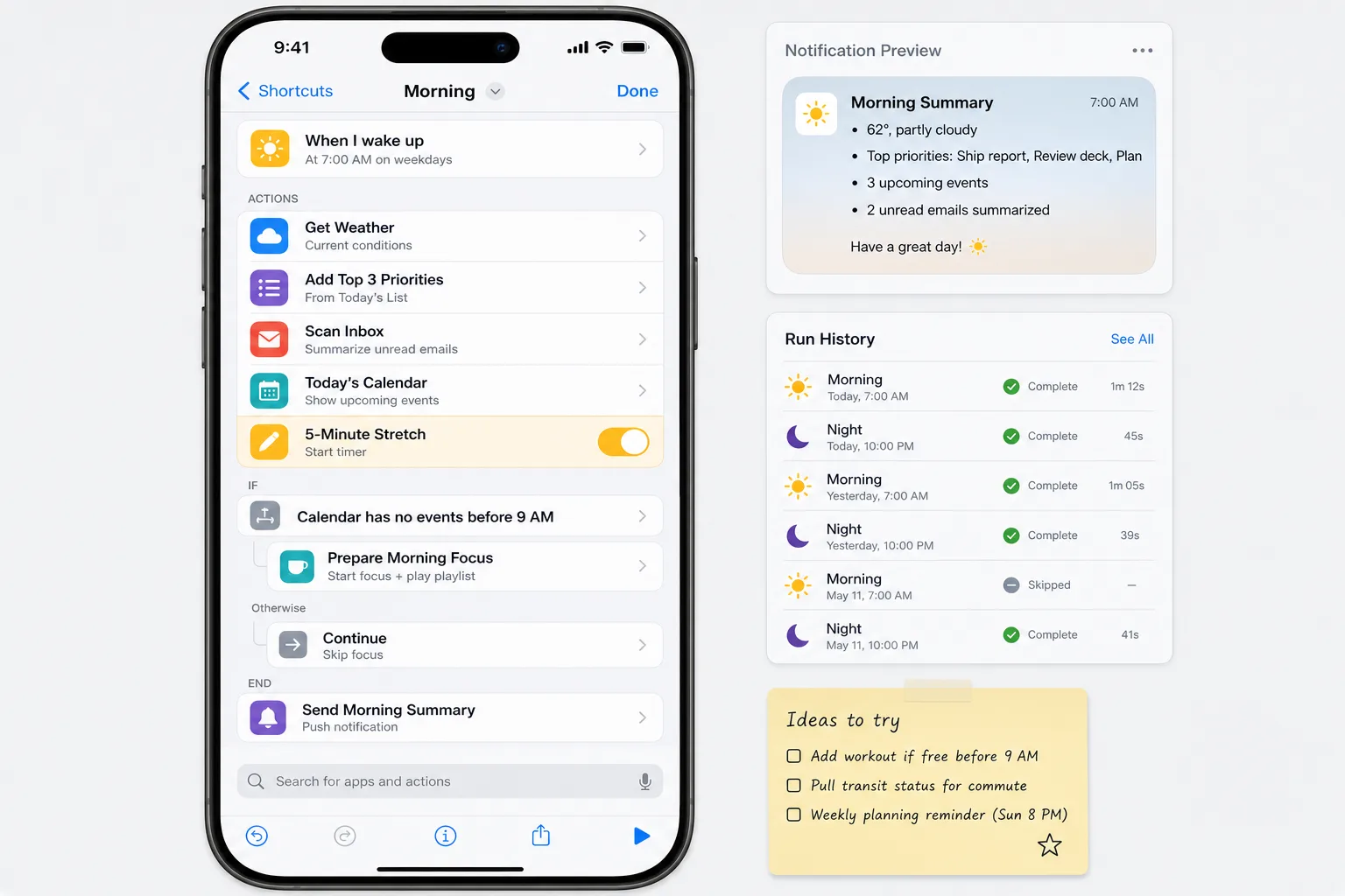
Morning and Night Automation
Small iOS Shortcut for a repeated routine.
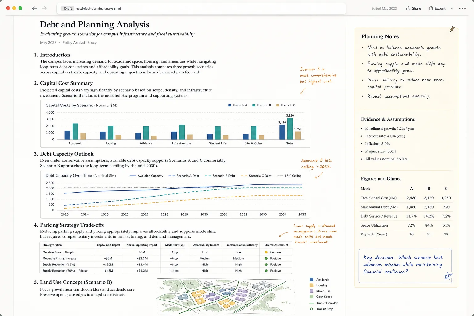
UC San Diego Debt and Planning Analysis
Campus finance and planning analysis.
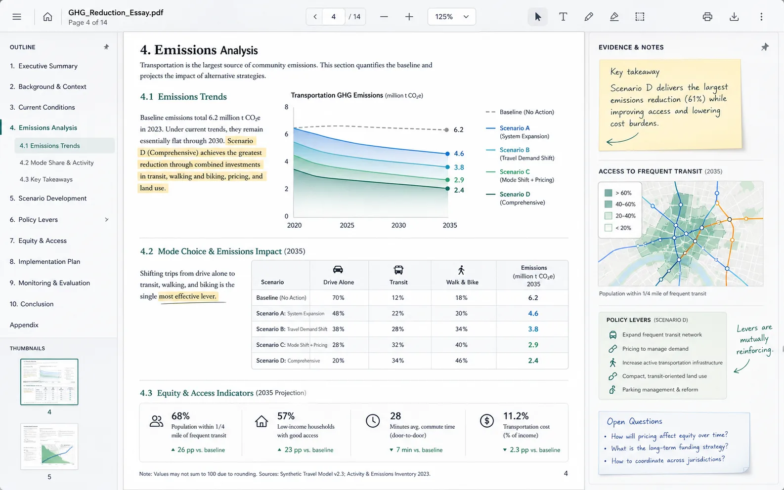
Greenhouse Gas Reduction Essay
Essay on access, mode choice, and emissions.
Archive and shelved work
Older work and shelved ideas.
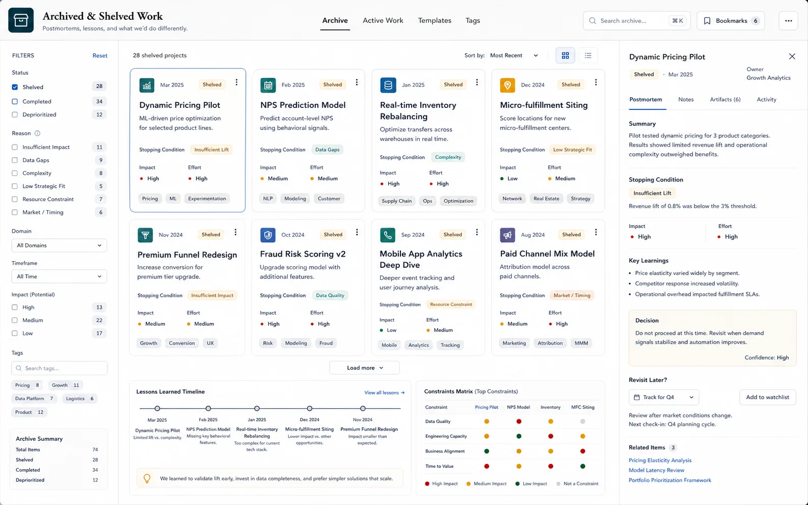
Archived and Shelved Work
Notes on older and shelved work.